| <<< Previous: "intro" page | Index | Next: "discography" section >>> |
|
|
| click on the image for a larger version |
Whereas the "intro" page is primarily aimed at newcomers, this is perhaps the most commonly accessed page by established fans, whether they've visited the site before or not. That's not to say that newcomers will find it completely useless but in this case, they are not necessarily the target audience.
The structure of the page is fairly simple: the news in text form, dates of upcoming gigs and perhaps the most important element, the "page last updated" blurb.
There are a lot of "stale" sites out on the web. Some are obviously old because they claim something old as "news" but the age of others can be hard to gauge. Something as simple as referencing the date of the last update but not specifying the year can leave your audience wondering whether a site is a year out-of-date or worse. As soon as they see that "last updated" blurb, they should be instantly reassured about the integrity of the information that follows.
At one time I had the gig news embedded in the text of the page but I eventually realised that was pretty daft because some people would come to this page for news of gigs and nothing else. Making them read through my waffle, which they may have read before, seemed to be a clumsy way of treating them. It seemed pointless to create a new page on the site for what may be just a couple of dates so I instead made sure that finding the gig dates on this page was simple and ridiculously obvious.
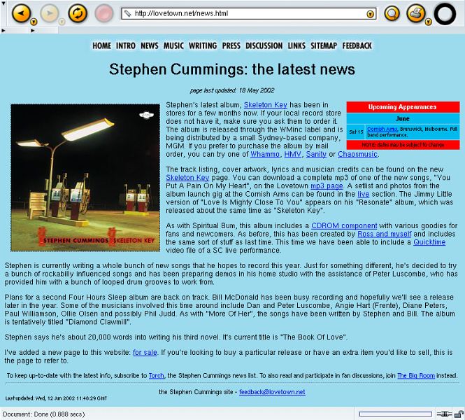
The presence of the album cover of Stephen's last album here is less important than it was when I first added it. As I was privvy to the look of the artwork before the album was released, adding it here then underlined the "official" nature of the site. Since the album release, it's a little less important except perhaps for existing fans who haven't been to the site before and are a little out of touch with recent developments. The effect on them could be "what the hell is that? I haven't got that album!"
In a similar way, some of the "news" towards the lower part of this page is getting a little old. That's not to say it's without purpose though: I can't predict how often people visit the site so keeping older stuff around for a while is useful to those occasional visitors.
My main criticism of this page is that I haven't added the news as a series of dated entries, starting with the latest news at the top. As web design guru Jakob Nielsen has pointed out, users of the web tend to scan through a page instead of reading in detail, as they normally would. If I had given them dated entries descending down the page they could at least quickly find the news they have already read and hence, quickly identify what has been added since then.
Why haven't I done this? There's no easy answer because I'm in two minds myself about which I should use. I think I prefer what I have because it feels more descriptive instead of some rapid and perhaps impersonal bullet-points of info. While the site can be described as "official", I'm still trying to make it feel as welcoming as possible for the fan. Presenting the text like this makes it a little more personal.
At the bottom of the page you'll see that I reference the mailing lists I run. I'll talk about those later in greater detail but there's a good reason why I mention them on this page: I hate receiving dumb email. While I'm happy to put an email address on every page of the site, there's nothing more infuriating for me than to receive an email that says "thanks for the news, can you email me when something else happens?" By pointing people towards the mailing lists here I hope to prevent the need both for their email and for my predictable response to it ("um, join the mailing list"). I think a comprehensive and well designed website can be measured by how little email it generates to the webmaster. :-)
| <<< Previous: "intro" page | Index | Next: "discography" section >>> |