| <<< Previous: Building Lovetown | Index | Next: "Intro" page >>> |
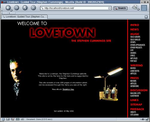
This is where it all starts. When someone ventures near Lovetown, invariably this will be their first port of call. Obviously, it's important it makes a good impression. Let's dissect the front page of Lovetown:

|
| click on the image for a larger version |
Isn't it cool and friendly?
Before I talk about it in great detail, I'd just like to introduce you to the audience because ultimately, they are the ones who matter most. The audience for Lovetown can be neatly divided into 3 groups:
But these people don't want anything cryptic. They've arrived at the site looking for an answer to an important question. How do I try to answer that question?
|
Key points:
|
There is also a photo (no, not the moody petrol pumps, the other one). If their question is "who the hell is Stephen Cummings?", well there's his picture. Their education has begun - they've got a visual reference. This person is no longer a complete stranger to them.
But more info is required. More info, more info, more info. How much? The text in the middle of the screen explains it to them. There's over 220 pages of info! Wow! That's a lot! This makes them feel more confident that their questions will be answered.
But how good is the info? How many times have you been to a site looking for info only to find it's been assembled by a raving loony who hasn't touched it for 3 years? The text makes it clear that Stephen supports the site and then at the bottom of the screen they can see that the site was updated very recently. Their confidence grows.
Okay, now where do they go to get that question answered? Instead of talking about his musical career, is this site actually 220 pages of information about Stephen's favourite potplants? On the right side of the screen, the site is laid out for them, starting with the very friendly "Intro". Then it skips through the other topics: News, Music, Writing, Press, Discussion, Links, Sitemap, Feedback. Hopefully it's not hard to make a guess at what will be found in each section.
The second group of visitors simply need reassuring that they have arrived at the official Stephen Cummings site. As before, a few things reassure them of that. The key thing is the photo because it offers simple and unambigious confirmation. If they don't recognise the face, they're probably at the wrong place. We then underline their confidence with "the Stephen Cummings site" and "last updated" text.
The third group (our "regulars") are familiar with what the site contains and simply want to get to the info they need quickly. From this page, every other page on the site is no more than 2 clicks away. If they want gig news, they click on "news". If they want lyrics for a particular song, they click on "lyrics" and then they can choose a song title. Yes, the site has reached a significant size but I like to think it's still just as usable as when it was first created (if not more so).
| <<< Previous: Building Lovetown | Index | Next: "Intro" page >>> |