| Index |
If you've read everything else here, I probably don't need to state this:
Content matters more than the look!
The reason why is pretty obvious: what causes people to return to the site? Do they return because the site is soothing to their eyes or do they return for good, hard info? A glamorous website with out-of-date content is not as useful as a less-flashy website which was updated with relevant information yesterday.That's not to say that graphic design doesn't matter at all, but it's not likely to be the reason why people return to the site.
Another important point should be stressed:
Good website design is different from good graphic design
Since the popularity of the Internet exploded a few years ago, many graphic design firms have extended their business to incorporate website design services. Many have done so without first learning the difference between designing an eye-catching advertisement and designing a usable website. As you and I know, the way we interact with an advertisement is very different from the way we interact with a website. You might spend more than five minutes exploring a website - it's unlikely you'll spend that long exploring a good ad. The design principles for each differ accordingly.I could try explaining the principles of website design to you in greater depth but I'd probably only re-hash everything that you'll find over at www.useit.com, a site run by web usability guru Jakob Nielsen. His preaching is backed up by research so ignoring what he says is something you do at your own risk. Yes, he does practise what he preaches.
lovetown.net graphic design
The graphic design of lovetown.net is not my work. I am fortunate to have the assistance of another nutty Stephen Cummings fan, Ross Robinson. Professionally, Ross works as a graphic artist for a small Sydney-based advertising firm The Collier Agency.
Like any good graphic artist, Ross has a great eye for design (and a good ear for music too). Left to my own devices, this site would look rather amateurish but that doesn't mean I simply let Ross run amok when devising a look for the site (he might prefer that I did).
The way the site is structured has been devised by me but I can claim little credit for it. In surfing many other sites, I have picked up ideas from here and there, and in some cases, I've brazenly stolen a big pile of them.
With the basic structure of the site worked out, Ross has then devised some graphic design that works with that. In doing this, he has occasionally decided to exclude some key element because it looked better that way and I've had to ask him to go back and revise it. Sometimes the change is minor while at other times there has been a certain amount of teeth-gnashing.
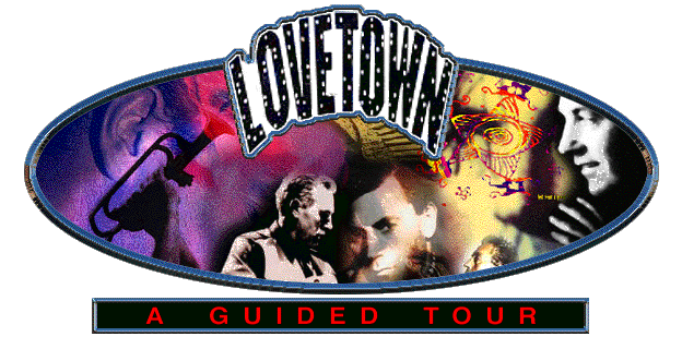
Here's one design that I rejected at the time:
|
|
| click on the image for a larger version |
What's wrong with it? Very little actually, except for the size. No, I don't mean it took up a lot of space on the screen, I was more concerned with the time it took to download. When this image was created, most internet users had 28k modems and this image would have made viewing the front page a slower process than I was comfortable with. If I were considering it now, I'd be less likely to reject it altogether. The only modification I might ask for is that Stephen's name appear in it somewhere. Oh, and I might also ask him to make the ear a little less prominent on the left. :-)
These days we tend to revise the look of the site every time Stephen releases a new album. In doing so, we tend to draw from the artwork of his latest album. For example, the petrol pump that can be found on the front page at the moment is taken directly from the front cover of Stephen's "Skeleton Key" album. While a new album gives us a good excuse for a facelift, I think the coinciding of the two serves to underline the "official" nature of the site.
| Index |